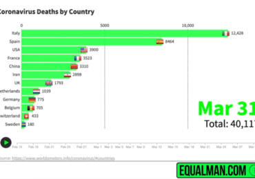
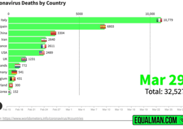
Coronavirus Statistics & Graphs (April 8, 2020) Bad News: U.S. had a record amount of deaths yesterday with 1970 beating the previous high of 1330 (April 4). Good News: Italy and Spain’s …
Coronavirus Statistics & Graphs (April 7, 2020)
Coronavirus Statistics & Graphs (April 7, 2020) Bad News: Spain has the most deaths per million (295). Deaths in New York might be underreported as they no longer have the capacity to swab the …
5 Content Optimization Mistakes You Wish You Knew Earlier
5 Content Optimization Mistakes You Wish You Knew Earlier Having a great content idea is first and an essential step for ranking top on Google search results. But it’s just that – The first s…
Coronavirus Statistics & Graphs (April 6, 2020)
Coronavirus Statistics & Graphs (April 6, 2020) Bad News: Italy’s death rate is 42%. Experts warn COVID-19 might be annual like the flu. Good News: Italy & Spain are starting to flatt…
Coronavirus Statistics & Graphs (April 5, 2020)
Coronavirus Statistics & Graphs (April 5, 2020) Please take 7 seconds like and share this with 1 person so we can help people realize why it’s so important to be smart. Comment if this is…
Coronavirus Statistics & Graphs (April 4, 2020)
Coronavirus Statistics & Graphs (April 4, 2020) The death rate continues to rise and is now at 21%. Tests are starting to ramp-up especially in the U.S. and the hope is that with larger numbers…
Coronavirus Statistics & Graphs (April 3, 2020)
Coronavirus Statistics & Graphs (April 3, 2020) 6-week-old newborn in Connecticut is the latest victim to COVID-19. Global cases set to break one million today. Please pass this along to remind…
Coronavirus Statistics & Graphs (April 1, 2020)
Coronavirus Statistics & Graphs (April 1, 2020) Please take 7 seconds like and share this with 1 person so we can help people realize why it’s so important to be smart. Comment if this is…
Coronavirus Statistics & Graphs (March 31, 2020)
Coronavirus Statistics & Graphs (March 31, 2020) Please take 7 seconds like and share this with 1 person so we can help people realize why it’s so important to be smart. Comment if this i…
Coronavirus Statistics & Graphs (March 30, 2020)
Coronavirus Statistics & Graphs (March 30, 2020) Look at South Korea’s movement in this graph versus the U.S. They were on the same curve as the U.S. and then flattened it. Why is the U.S…


