Best Email Design Practices That Will Make Your Campaigns Irresistible
Every day as thousands of emails flood your inboxes, which are the ones that you find yourselves drawn to? The ones with the best design, right? That’s the power good email design holds over audiences worldwide. We are visual creatures by design; it is no surprise thus that we respond better to information when it is presented using visual media than plain text.
Good email design plays a significant role in ensuring the success of the campaigns. It is that factor that tips the scales in your favor during high traffic times of the year such as Thanksgiving, Black Friday, Cyber Monday, Christmas, and the like. It doesn’t matter how insightful, and informative your content is- at the end of the day, if it’s not designed properly, it’ll never get across to your audience in the way in which you want it to. Now, there’s, of course, no one-size-fits-all philosophy when it comes to design. But, there do exist certain best practices that can make your email campaigns the cynosure of all eyes when adopted. And that is precisely what we’re going to discuss in today’s article. Dive in to find out!
Make Your Subject Lines Compelling
Don’t worry; you are still reading an email design blog. So what if subject lines are not actually a part of your templates? When you come to think of it, subject lines are what lead your audience to your emails in the first place, don’t they? Therefore, crafting compelling and engaging subject lines must be one of the top concerns for email marketers out there.
Here are some things you can keep in mind while composing your subject lines:
- Try to be economical with your words. A long and winding subject line will only do you more harm than good.
- Ensure your subject line doesn’t have unnecessary punctuation or overuse of uppercase. This will just set off the spam filters.
- A surefire way of grabbing your readers’ attention involves evoking a sense of curiosity or emergency with your subject lines.
- Use emojis. 56% of brands that included emojis in their subject lines reported having observed higher open rates than usual. Emojis help you convey sentiments challenging to articulate through words and hence are consumed more readily by the audience. Oh, and don’t forget to test your subject lines when you’re adding emojis. Some emojis render differently across different platforms (and a few email clients don’t support emojis at all!), so it is ideal to be on the safer side with testing.
- Use personalized subject lines. Personalization can earn you a 26% rise in your open rates. They go a long way towards winning your customers’ trust and loyalty, paving the path for long-term relationships.
- Convey the gist of your email in your subject lines. Often in a bid to be quirky, brands end up being too vague in their subject lines which ultimately hampers their engagement rates.
Here are a few examples of subject lines that are worth their weight in gold.
Zwift: Last Chance: Save $100 on the Tacx Neo 2T (Source)
Better Brand: What’s in our bagels? (Source)
Morning Brew: ☕️ Caution: Morning Brew coming in hot (Source)
Typeform: Are you missing a trick? (Source)
LendingTree: Smiles Davis, check out your LendingTree Savings Dashboard! (Source)
Craft Striking Pre-headers
Pre-headers serve as a preview of your emails and are also the second thing the audience notices after the subject line. Making your pre-headers appealing and attention-grabbing, thus, can help you fetch increased opens and click-throughs. Make sure, however, that your pre-header complements your subject line and is not just a paraphrased version of the same. And keep it brief and crisp- aim for 60 characters or lower. Adding a CTA (call-to-action) in your pre-header could further improve your email’s chances of getting opened.
Want to know what an effective pre-header looks like? See these examples.
Get Your Sender Name Right
You can be creative with many elements when it comes to your email template, but your sender name should not be one among them. Your sender name serves only one purpose – informing subscribers who they are getting the mail from. Should your sender name happen to be even mildly confusing or deceptive, it’ll put your email in the red zone of either getting ignored or marked as spam. While in most cases, the company name doubles up as the sender name, you can consider the following forms to mix things up every now and then:
- Add a person’s name along with the company name- Kevin from Email Uplers
- Mention the department name alongside the company name- Content at Email Uplers
- Add the prefix crew/team/community to your company name
Communicate With Your Email Layout
If done right, the arrangement and organization of the various elements in your email layout can really add an additional layer or two of clarity to your messaging. Define visual hierarchy in your emails so that your recipients can spot what they’re looking for with ease. Even though your emails pack a lot of information, certain nuggets occupy the top of the pecking order, right? An effective email layout lets you effectively accentuate those bits.
Broadly, brands employ the following three kinds of layouts in their emails.
- Inverted Pyramid Layout: The inverted pyramid layout lets you create highly focused emails in which the attention of the reader is led towards the CTA button. An email made using this framework typically contains a header or hero image that catches attention, followed by a crisp copy that builds excitement and is ultimately capped off by a CTA. Hook, line, and sinker.
 Take a look at this email from alder to understand how the inverted pyramid layout works.
Source
- Zig-Zag Layout: Yes, it’s exactly what it sounds like. In this framework, the content and visual elements are arranged in a zig-zag fashion, resulting in an incredibly visually appealing outcome. Moreover, scrolling through the information presented in this format is far more convenient than the rest. That’s why when brands have to send content-heavy emails, they invariably use the zig-zag layout.
 This email from Adobe is a picture-perfect example of the zig-zag layout.
Source
- Single-column Layout: The single-column layout is a minimalist framework and, in this list, perhaps the one that is most friendly to mobile users. The flow of information in a single-column layout is generally sequential, which makes your email content easy to consume as well.

This email from Moment illustrates how the single-column layout looks like in practice.
Source
Use High-Quality Images
The human brain processes images much faster than text. So, adding images to your emails is an excellent way of making them immersive, visually attractive, and engaging. However, if you truly want to leverage the power of images, you need to keep the following things in mind:
- Be meticulous with your curation. Your image must be relevant to your brand and complement your email copy. Using irrelevant images can greatly undermine your messaging.
- It doesn’t matter whether you’re using stock images or real so long you ensure that they are of exceptionally high quality. If you want your images to bowl over your audience, their resolution has to be absolutely top-notch. Besides, using poor-quality images can significantly hurt the credibility of your brand.
- While using high-quality images is very important, equally vital is factoring in their file sizes. If your email has too many large and high-quality images but none of them are optimized, the loading time will shoot through the roof. And very few things draw the ire of the people as passionately as slow-loading emails. Optimize your images and steer clear of that line of fire.
- Keep in mind the image-to-text ratio at all times. Emails that have too many images and too little text trigger spam filters which ultimately affect your deliverability. Try to maintain a ratio of 80% text to 20% images while designing your email campaigns.
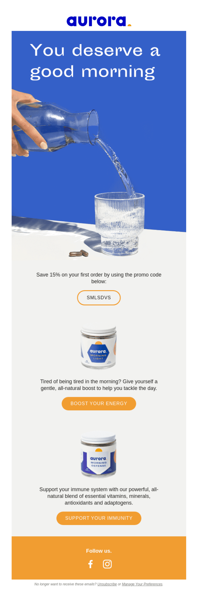
If you can’t figure out how to use images in your emails, look no further than these examples:
Design for Email Accessibility
Email accessibility refers to the practice of designing and sharing emails in such a manner that audiences with visual, auditory, cognitive, mobility, and other disabilities can understand, access, and interact with them. Hence, by making your emails accessible, not only do you foster inclusion but also maximize your reach.
So, what goes into designing an accessible email? Let’s find out.
- People with visual and cognitive visual impairments use certain software and tools called screen readers to access the content and graphics that appear on the screen of their electronic devices. Screen readers consume content very differently from us. They vocalize both the email content and its structure, pause for punctuation marks, announce page titles and heading levels, and attempt to spell out the letters of acronyms. Therefore, email marketers must familiarize themselves with all screen reader norms to make their content as screen reader-friendly as possible.
- Specify the alt text for all the images in your email so that they may be read by the screen reader. While you’re at it, try not to include any important information in your images. When you’re designing emails for accessibility, visual elements assume lesser precedence. Their presence should serve to accentuate the content but their absence must not rob your email of the message it wishes to convey.
- While coding your emails, don’t forget to add the lang attribute. Without it, your recipient’s screen reader will assume that the language of your email is the same as the default language the user chose during the screen reader’s installation.
- People with dyslexia often find it difficult to read text that is center-aligned. So, avoid using center-aligned copy in your emails.
- Approximately 4.5% of the world population is color blind. So, you should be mindful of your use of colors and contrast to make your emails accessible to them. To determine the best fit for your subscribers, you may consider taking the help of color contrast analyzers or online contrast checkers. Certain inbox preview tools offer color-blind previews as well which can further assist you in your template design process.
Do Not Ignore Your CTA Buttons
Often, designers spend too much energy arranging the content and polishing the visuals that they tend to overlook the very factor that fetches them business- the CTA button. Other than the inverted pyramid layout that intuitively leads the readers towards the CTA, you need to be inventive with other frameworks to make sure that your CTA button stands out. Ideally, you should aim to place the CTA button above the fold so that it catches the recipients’ attention as soon as they open the email. However, to improve your chances of conversion, you should try strategically placing a few CTAs below the fold too.
Besides looking after the placement of your CTA buttons, you need to curate their appearance as well. What shape do you want them to be? What color should they take? What size should they be? Answering these questions will enable you to design an attractive and attention-grabbing CTA button. Equally important is to pay attention to your CTA copies. Gone are the days when people used to respond to the generic phrases of “Buy Now” and “Click Now”. Modern-day customers respond to CTAs that are smart, quirky, and intriguing.
Take a look at these examples to draw some inspiration.
Wrapping It Up
While sticking to these best practices will certainly help your campaigns cut through the noise, there’s one more thing you need to take into consideration if you want your campaigns to be invincible- email design trends. Every year, the email landscape finds itself governed by a new set of design trends. So, to maximize the visibility and relevancy of your email campaigns, it is important that you design them in accordance with all the latest trends. With 2022 virtually knocking at our doorsteps, the team at Email Uplers got together to predict the design trends we think will be adopted by marketers in the year to come. Want to find out what they are? Read the infographic on Latest Email Design Trends! Here is a quick look.


 Source

