What Are UX Design Patterns?
UX design patterns are simple, repeatable solutions, or ways to address design problems that occur as a result of the design characteristics and nuances of a website, in a predictable fashion.
Put more simply, UX design patterns are predictable ways that designers come up with for users to interact with a website.
For a real-world analogy, consider the keyboard layout on your computer. It has a predictable design and hasn’t changed in several decades.
Web designers ask their visitors to do some very standard tasks that must be easy to accomplish. These functions include signing up, logging in and out, and sometimes submit email addresses and other valuable information.
For all of you who already know how to create your website, you’re probably already familiar with the user experience issues from both sides.
Since most Internet users tend to access the complicated web and mobile applications on a daily basis, the fact that we have to re-enter our information continually can become tedious. This presents opportunities for us to implement UX design patterns to make things easier.
Do UX and UI Patterns Have Similarities?
User interface design is the part of the website that the user interacts with upon arriving at a site. User experience is the broad scope of the website itself, and the feelings, emotions, and impressions that the user comes across upon looking at the site.
Roughly speaking, whereas UI deals with form, UX focuses instead primarily on function. This means that UX patterns and UI patterns have some overlap, and sometimes the terms are used interchangeably. And some design philosophies consider UI to be an integral part of UX. Hence, without good UI you will never have good UX.
Some UI libraries contain ideas and solutions that address UX problems, such as user flows and empty states. Other UI libraries just showcase ideas for creating engaging user interfaces.
The Importance of UX patterns (mention Shay-Ben-Barak)
Human beings tend to be creatures of habit. When we are faced with (or introduced to) things that are new, we learn and develop ways to interact with them. Sometimes they start out as crude, and they become refined over time.
When we encounter familiar conventions that have an existing paradigm, we already know how to use them because these behaviors have already been shaped through previous interactions. The result of this familiarity is a rewarding feeling of satisfaction, safety, and security.
When the familiar conventions are broken, however, the results are significant issues in usability, function, and efficiency.
UX design guru and cognitive scientist Shay Ben-Barak conducted a simple experiment to quantify the effect that disruptive patterns have on the performance of tasks.
Intuitively, we know that deviations from conventions have adverse effects on productivity, reaction time, and satisfaction, so naturally, the question is: “how much?”
Experiment Goal
Ben-Barak sought to demonstrate the decrease in performance that people experienced when working with a non-standard pattern, as measured regarding reaction time and mistakes.
The experiment also included mistakes that were noticed and corrected, as well as errors that had gone unnoticed.
The analysis used a standard telephone keypad as a common pattern and a novel, yet still logical, a variation of the keyboard as a disruptive model:

Standard keyboards are found universally in telephones that do not have rotary dials, and we all know how to operate one without much thought, effort or concentration. This skill is primarily psychomotor.
However, the disruptive keypad requires cognitive functions. Users are simply not accustomed to using it, and there is a small, but definite learning curve in getting it to work.
Most importantly, the disruptive keypad competes with the standard keyboard. Our previous experience with using the standard keypad interferes with our ability to use the disturbing keypad with the same amount of accuracy and dexterity.
Again, the question is, “how much?”
The Experiment
Shay Ben-Barak developed a web app based on a jQuery keypad for the participants’ inputs, and a MySQL to record the data. The experiment asked the participants of the experiment to dial a ten-digit phone number from memory twice: first using a standard keypad, then a second time using the disruptive keypad.
There was a three-second-countdown screen before showing the keypads. Also, the web app measured and recorded the performance time for dialing the ten-digit number, as well as the number of occurrences the backspace button was tapped.
Results and Discussion

The experiment was conducted in November 2015, using Android and Google Chrome browsers. Around 150 subjects participated in the study. Some results were excluded, such as easy-to-type number patterns, such as “1-2-3-4-5” as well as inordinate outliers that may have occurred due to technical issues. The final count was 130 valid pairs of inputs.
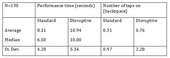
Based on the table, the average time required to dial a ten-digit number on a disruptive keypad was 35 percent longer than on the standard keyboard. The median time to enter the number was 54 percent longer on the disturbing keypad as compared with the norm.
Ben-Barak also noted that 28 of the number pairs didn’t match up correctly. It is safe, therefore, to assume that the number was correctly entered on the standard keypad, but incorrectly entered (and even unnoticed!) on the disruptive keypad.
Conclusion
Quite simply, a non-standard keypad, even though it is still logical and not too different from the standard, can slow down performance by up to 50 percent, and increase the likelihood of mistakes.
The lesson: These results can be applied to UX patterns. Look for patterns that already exist and work well. As the saying goes, “If it ain’t broke, don’t fix it.”


